
GRADUATE CLASS PROJECT
Responsive Design with Uniqlo
Discover and fix UX issues in the checkout process of an e-commerce site and create responsive designs for mobile, tablet, and web.
CLASS
Experience Design Studio 1 (CMCI Studio, formerly BDW)
SKILLS
UX Design
UI Design
E-commerce Strategy
About the Project
In a graduate user experience design course at CU Boulder, we were tasked to evaluate an e-commerce site of our choice for user experience design opportunities and to create solutions to help them reach their business goals. I chose the Japanese retailer, Uniqlo.
Learning Objectives
In this project, I developed an understanding of how conversion helps solve business needs, how to design across multiple devices, and developed the technical skills to communicate digital solutions.

Create high fidelity, interactive wireframes and prototypes using Sketch and InVision.

Discover the interrelationships of the problems that Uniqlo and its customers are facing.

Create responsive designs for desktop, tablet, and mobile.

Provide UX solutions to improve customer conversion.
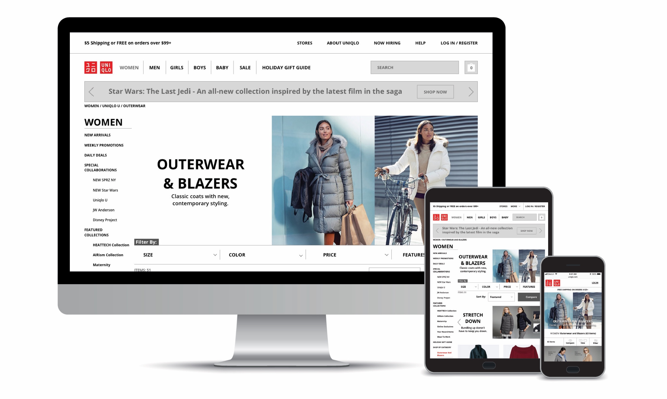
High fidelity prototypes of Uniqlo.com
UX & Business Challenges
UX & Business Challenges
Uniqlo’s E-commerce Challenges
In a Forbes article titled, “Inside Billionaire Uniqlo Founder Tadashi Yanai's Quest To Build The World's Biggest Retailer,” Uniqlo’s founder Tadashi Yanai says “he aims to boost revenues of Uniqlo parent Fast Retailing to $29 billion by 2020, up from $17 billion in the year through August 2016.” As of 2017, Uniqlo is ranked the third-largest retailer globally, behind Zara and H&M. With the revenue goals Yanai has set, it seems he wants to jump to the number one spot.
Boosting sales on Uniqlo’s e-commerce site is one way to help Uniqlo boost its revenues, although online sales currently only make up 5% of revenues (with 20% of American sales being online). Yanai wants to increase this number to 30% and has stated that he is, “not happy about the business performance of e-commerce.” Unfortunately, Uniqlo’s e-commerce sales are also lagging behind Zara and H&M who both pull in an estimated 10% of sales from online.
With that known, I looked into how Uniqlo’s web statistics stack up against Zara and H&M using the analysis tool on SimilarWeb.com.
Source: https://www.forbes.com/sites/chloesorvino/2017/04/05/too-big-data-for-his-drawers/#3d6f93a2b8a4

Source: https://www.similarweb.com/website/uniqlo.com
Approach
Uniqlo.com is doing well compared to the e-commerce industry average statistics of average visit duration, pages per visit, and bounce rate. But if founder Yanai’s goal is to become the largest retailer globally, bringing Uniqlo’s e-commerce website up to par with that of Zara and H&M is an important first step digitally.
Project Goals
Zara and H&M’s e-commerce sites display noticeably better web statistics and pull in twice the amount of sales than that of Uniqlo in terms of percentage in overall revenue. To find out why this was the case, I looked for UX commonalities, differences, and general UX issues on Uniqlo.com.
Increase checkout conversion by 3%.
Increase average visit duration from 4 mins 28 secs to 6 mins.
Increase pages per visit from 6.43 to 10.
Find and fix UX issues across the site.
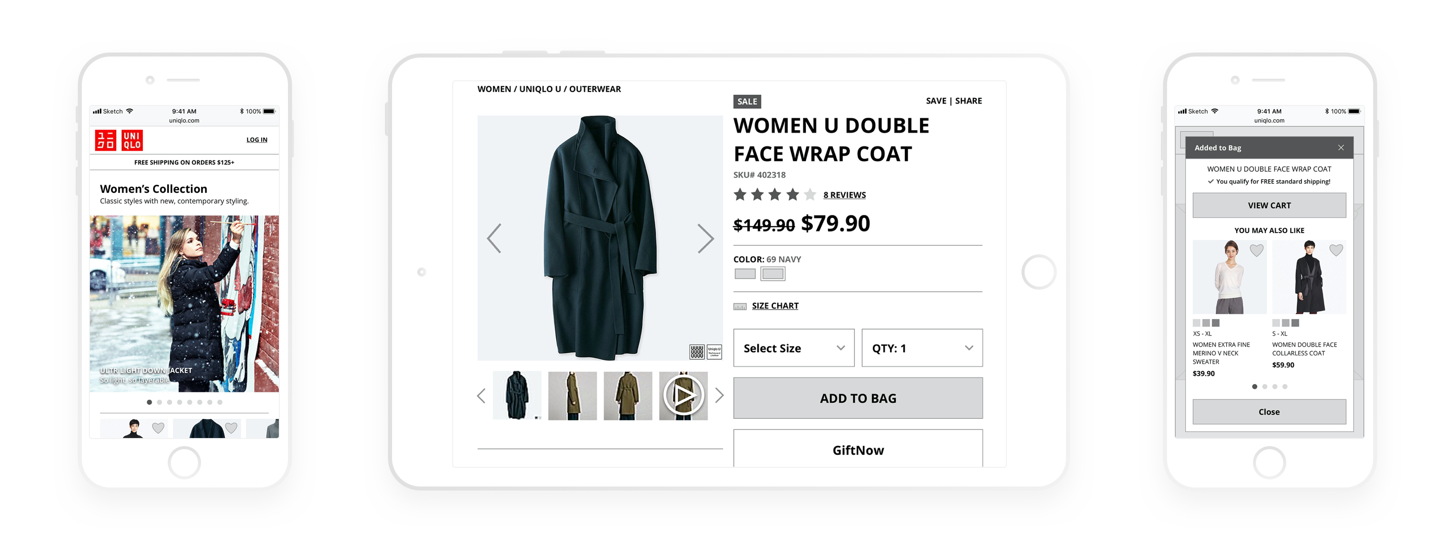
High fidelity prototype of updated Uniqlo checkout process on mobile web
UX Solutions
With the goal of increasing checkout conversion by encouraging users to stay on the site longer and look through more product pages (reducing site abandonment), I went through Uniqlo’s checkout process to find existing UX issues. I incorporated the following solutions into a high fidelity prototype:
Create a product comparison tool to simulate how a customer might compare articles of clothing in the store.
Present clear notification of free shipping on orders of $125 or more throughout the checkout process.
Add breadcrumbs to enhance site navigation.
Add an ability to filter by number of stars in the ratings distribution section.

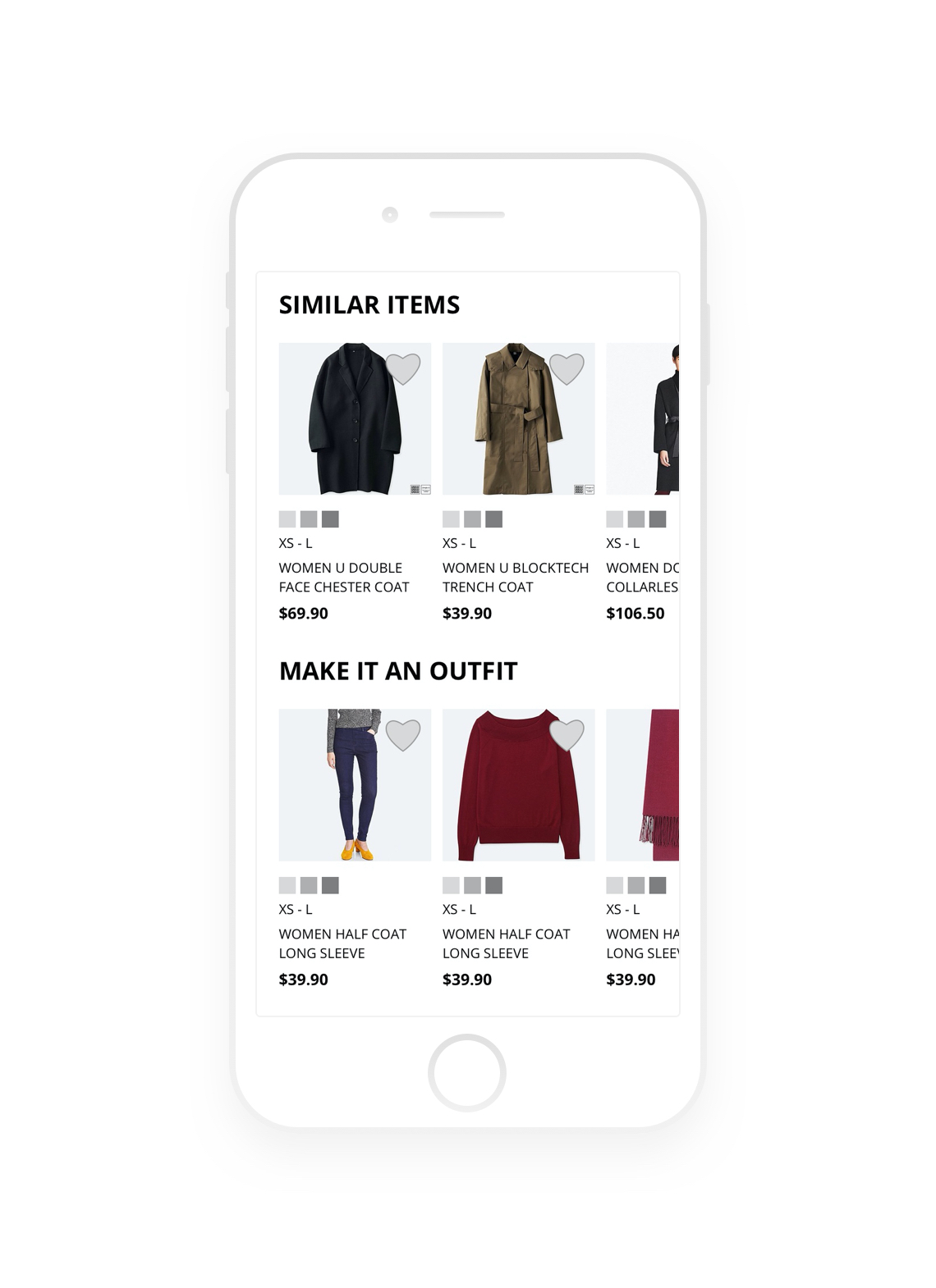
Add a “Similar Items” section to help users find more products they might like.

Add a “Make it an Outfit” section to encourage users to view matching assessories and complementary products.
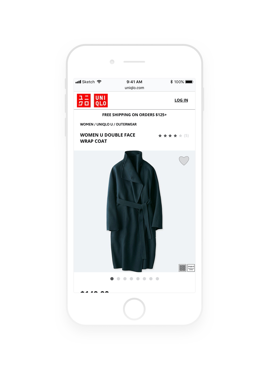
Breadcrumbs and Free Shipping Notice
Breadcrumbs and Free Shipping Notice
Breadcrumbs and Free Shipping Notice
Breadcrumbs improve navigation abilities for users who are going back and forth between individual product pages and category pages, a likely scenario when shopping for clothes and accessories.
A clear indication for what qualifies as free shipping on the product page means users do not have to abandon the product page to look for that information elsewhere.
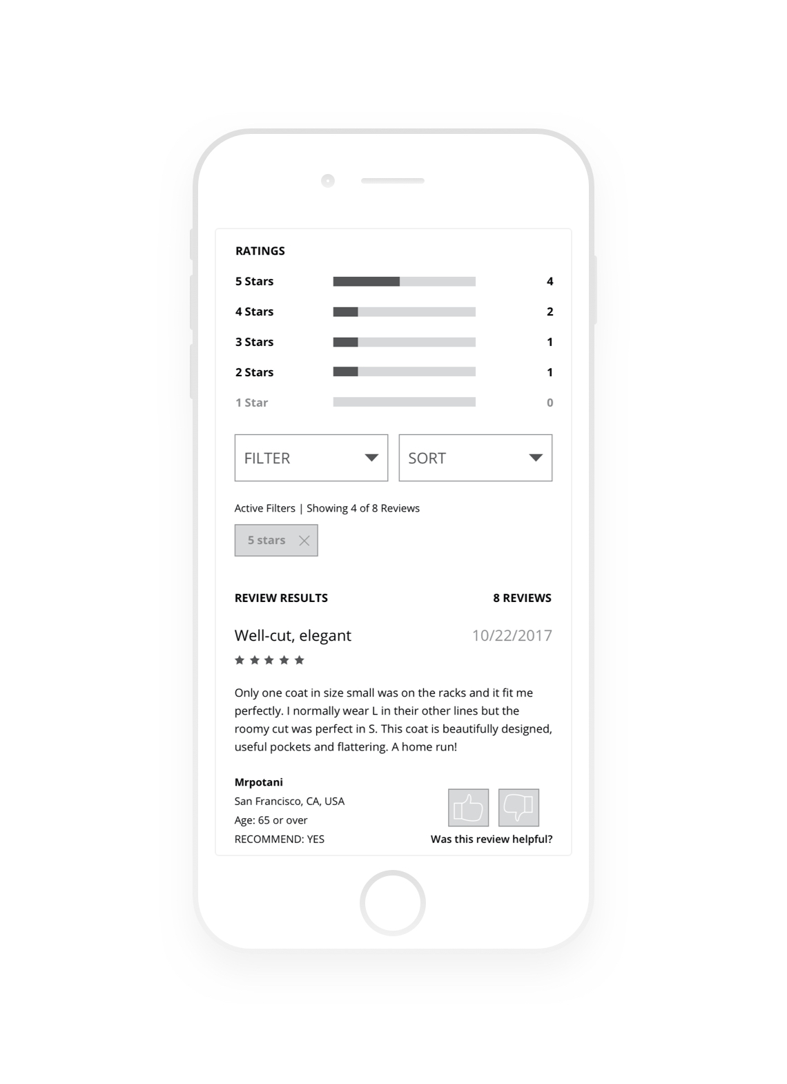
Making the Ratings Distribution Clickable
Making the Ratings Distribution Clickable
Give users the ability to sift through good and bad reviews. Being able to easily see both ends of the spectrum gives the user a better idea of what the product is like.
Alternative and Supplementary Products
Alternative and Supplementary Products
The “Similar Items” section helps the user find the best match for what they are looking for. The “Make it an Outfit” section shows other clothes and accessories that complement the item on the page. Both allow more items to be viewed without having to use the category navigation or search, or abandon the site entirely.
Responsive Design
I designed the comparison feature on mobile-first. I feel taking this approach provides me with more focus when later designing for desktop, where there is a greater amount of space to work with.
Designing for Desktop
For desktop, I took advantage of the fact that the user is able to see more information on one screen as opposed to mobile, where they might have to interact with the site more to see more details.
High fidelity prototype of a comparison tool on desktop
High fidelity prototype of a comparison tool on desktop
High fidelity prototype of comparison tool on mobile web
Designing for Mobile
For the mobile design, I took advantage of the swiping gestures to fit all the important information of each comparison item.
Learnings
My biggest take away in this graduate project is learning how to use UX solutions to solve business problems throughout the checkout process of an e-commerce site.
Creating high fidelity, interactive wireframes and prototypes using Sketch and InVision.
Understanding how solving customer problems can also solve business problems.
Understanding the approach and mindset for creating responsive designs for desktop, tablet, and mobile.
Discovering UX solutions that can improve customer conversion on an e-commerce shopping experience.
Future Iterations
The focus of this project was on learning how to incorporate UX digital solutions, learning UX tools, and learning how to design for responsive web across multiple device types. Customer research and interviews were not a requirement but would be an important step if I were to take this project further. In that case, I would test the site with 5-7 users and observe common problems and major frustrations that arise.
In addition to the exploratory interviews, another interesting area to explore is a redesign of Uniqlo.com’s clothing size chart. The way it is presented now is daunting and confusing, which may lead to many returns. According to retail research firm Customer Growth Partners, online retailers experience a 30% return rate. If Uniqlo can decrease their return rate by providing a more intuitive size chart, they might be able to save a lot on money and resources.
Source: http://blog.boldmetrics.com/apparel-retailers-start-2016-with-a-30-return-rate/
Selected Works